
Crisp
Creating a Track and Trace.
project DETAILS
CLIENT:CRISP BV
DATE:11TH DEC, 2019
Location:Maarssen, The Netherlands
Crisp is a online grocery store that sells people wholefoods at home. In a collaboration with Routigo they wanted to create a experience for their customers to be able to track their order in modern fashion.
One of the problems Crisp encountered was that people needed to know when their orders came in so they could start cooking. The track and trace on the desktop was not enough so they opted to design for mobile.
1. OBJECTIVE
Design a simple track and trace. While there are a lot of business requirements make the information digestable and meaningful to the user.
2. MY ROLE
I was the main designer of this project. Primarily bussy with the ideation of the concept and the making the prototype and design.
3. APPROACH
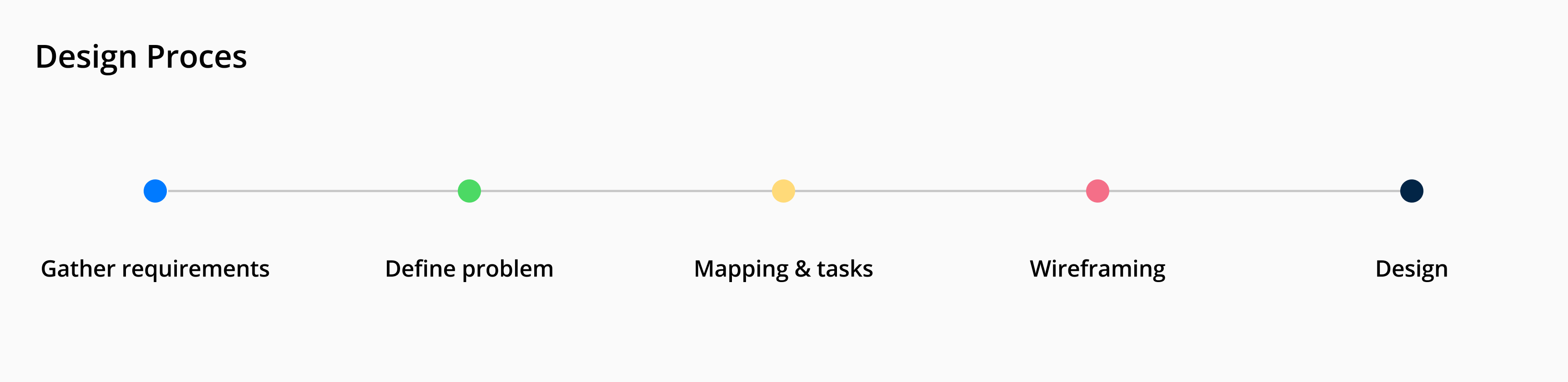
Gather user data from Crisp and business requirements, then proceed to ideate the concept and design prototypes for testing.
Gather Requirements
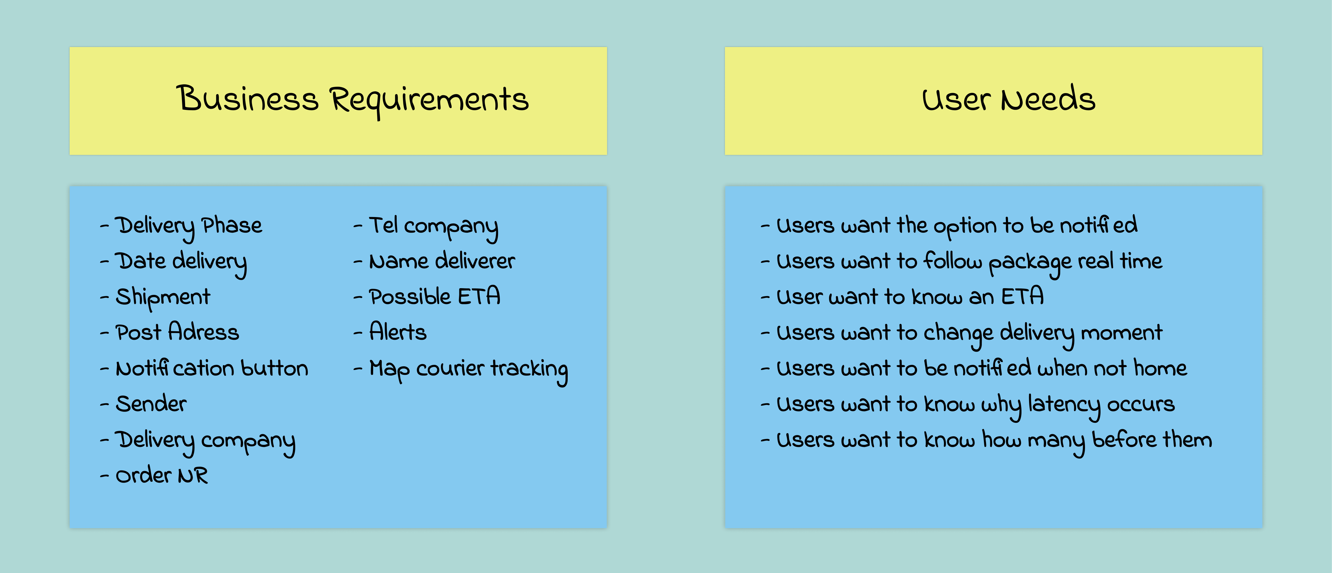
Business Requirements
These requirements came from Crisp themselves. The data in the list below came from their backend and needs to be there as part of their requirements. This is a lot of data to show so it's a challenge to make a clear UI without clutter.
User needs
Since I joined the project halfway I was not part of the research phase. These user needs were given to me and they asked me to take these into account while designing the Crisp Track and Trace.
1. Chances
I see chances for the required data in showing only what is necessary. There is no need to put all the data in the users phase. We need to be smart with the presentation.
2. Threats
Its a list of data and a possibility that every phase (screen) looks the same. I need to find out what visual support can help the user with differentiating.
3. Next steps
The next step in the process would be the ideation phase. Time to generate some ideas about how we are going to build the product. Starting off with a journey.
IDEATE
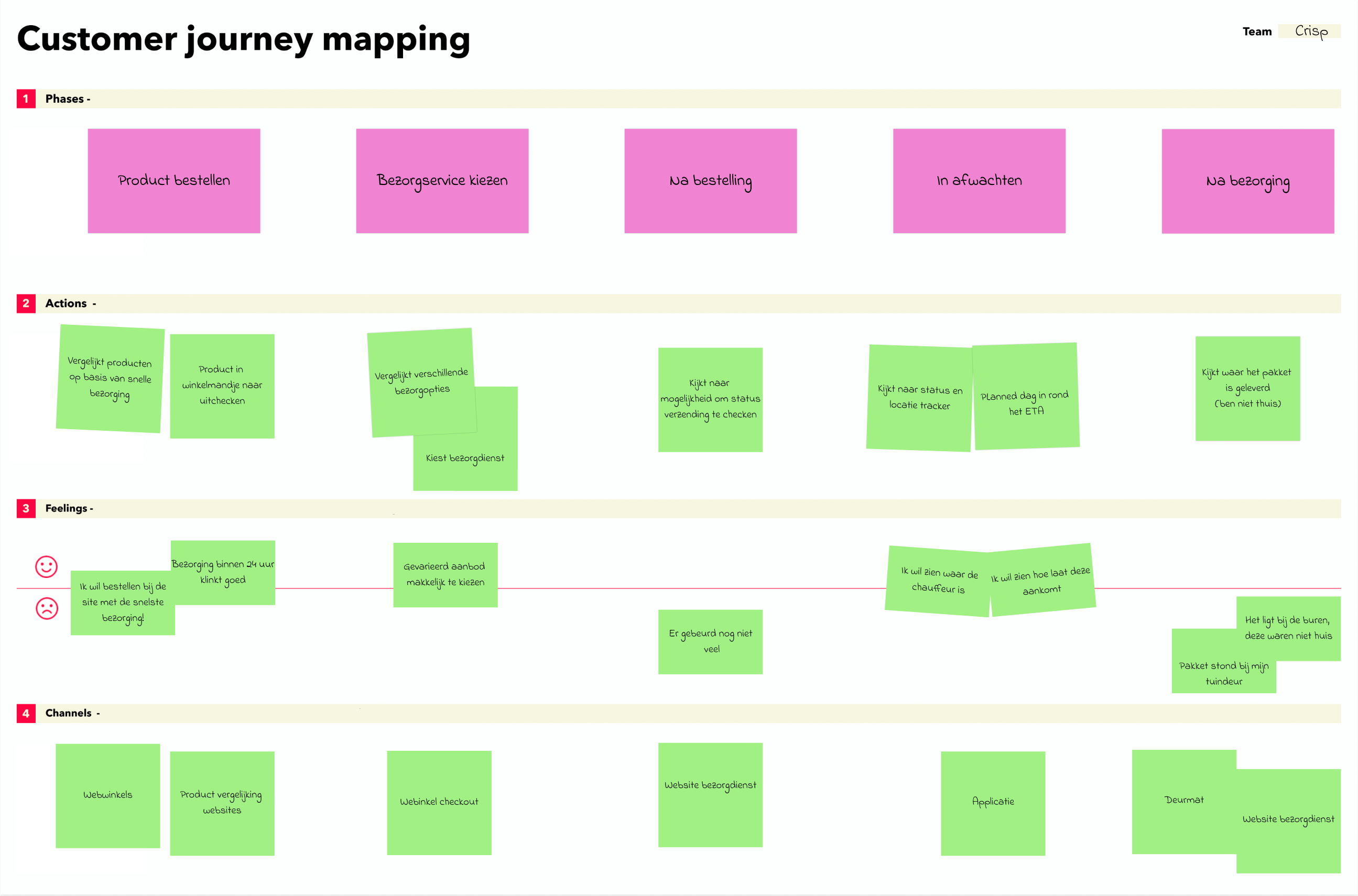
Mapping
We mapped out the experience of the user receiving an order. In order to see what phases a user go through and which content per stage is important them. From there we could decide which and how many screens would be meaningful.
User flow
We devided the the process of making an order to receiving into 5 steps. The first one is ordering, second choosing delivery, third after delivery, fourth waiting on order and last after delivery.
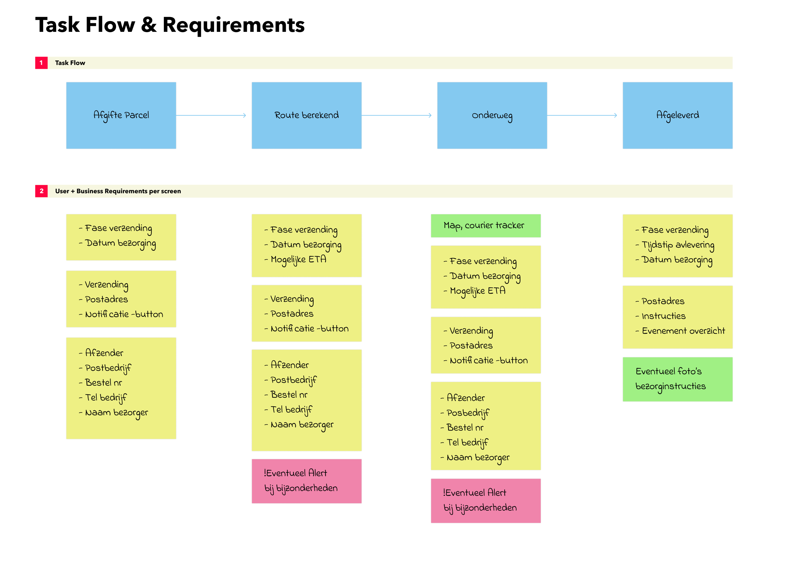
Task flow
After mapping out the experience of the user we defined a couple of meaningful interactions with the product. We let them know when package is delivered, we let them know when the route is calculated, when he's underway or when its delivered.
User flow
With these touchpoints in mind I started placing the right content by each interaction which was required by the business. After the design of the task flow we could carry on to the designing of the actual screen so I could make a prototype.
1. Variable content
There is much info to be show but there is a time and place for everything. I opted to show content when its meaningful and otherwise remove it.
2. linear flow
In the preparation phase the user can do multiple things. The first would be checking out different stops and the second filling in the prerequisite data.
3. unique insight
During the driving the user checks the map for stop activities and when the route is done the user can finish it by pressing a button and checking out a form.
PROTOTYPE
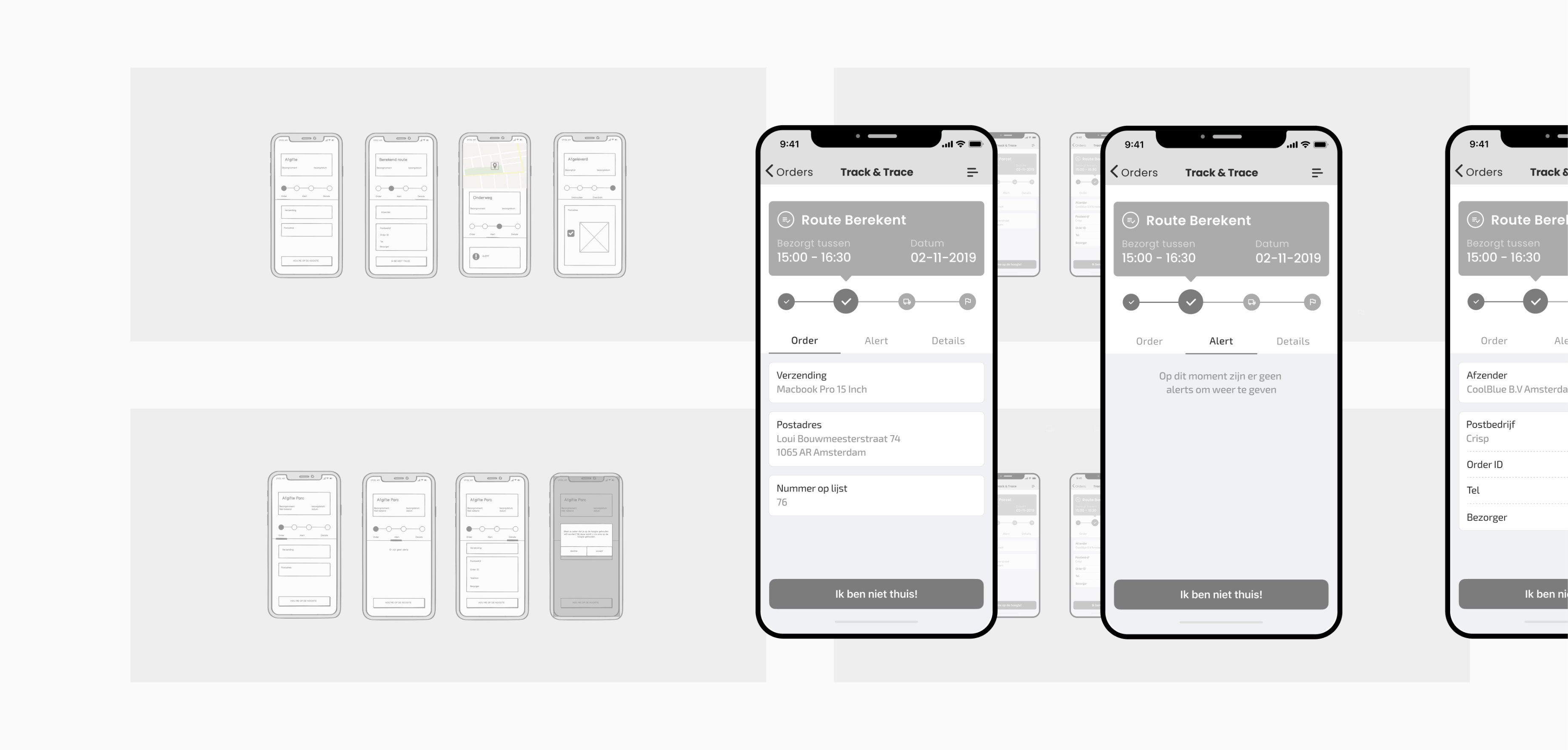
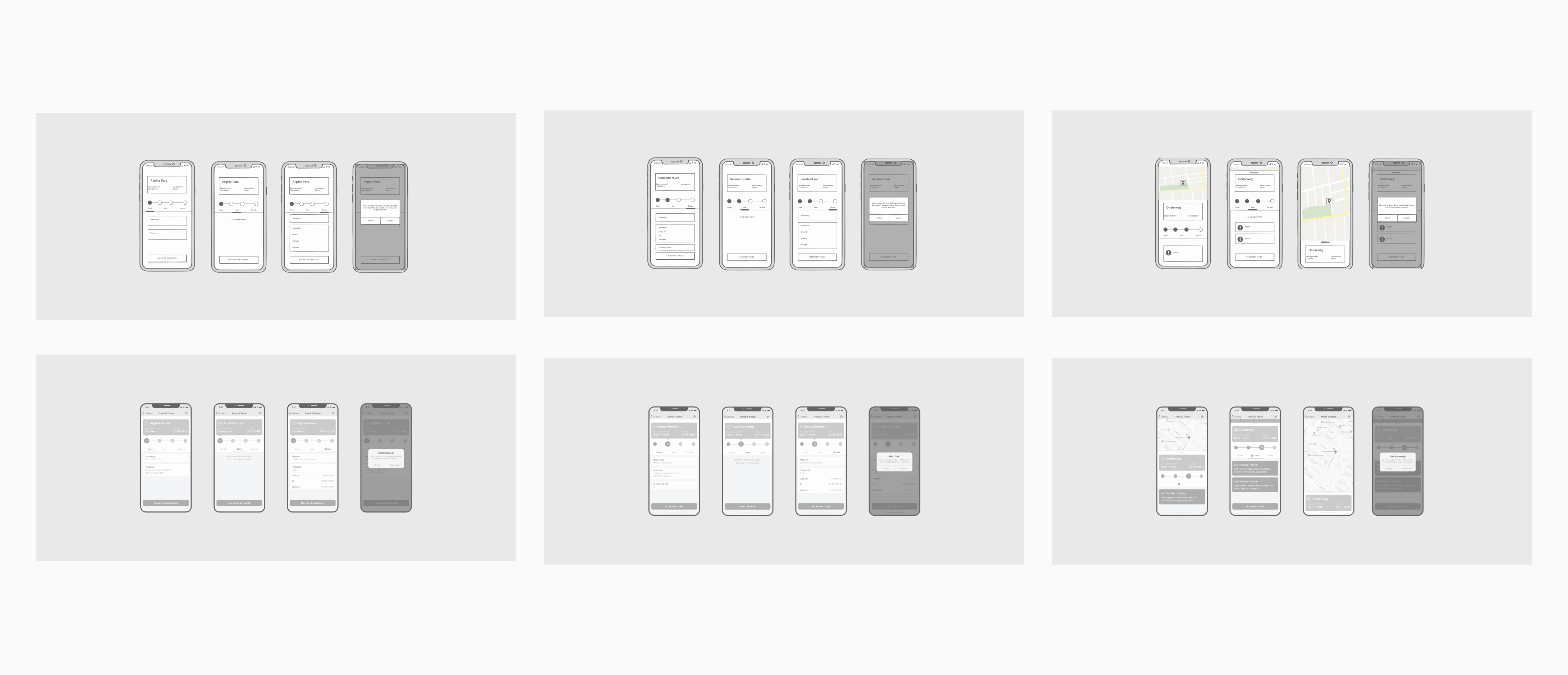
Wireframing
A collection of my wireframing process. At first made some wireframes using Balsamiq. After internally discussing the results with stakeholders I remade them in Figma. Finally I turned them into a prototype listed below.
User flow
The prototype was tested with users by someone else. When the results came back I made a few small adjustments and started with the final design. I tried to make sure the product matched the branding perfectly.
1. What
According to the task flow I made four screens per interaction. The user if he chooses can be notified when changes occur or cancel the delivery moment.
2. How
A button on the bottom lets the user choose to be kept up to date. After pressing the button it changes to a delivery moment change.
3. Why
It is not always appearant that the user wants to be notified. Some people have a problem with push notifications, mail or sms.
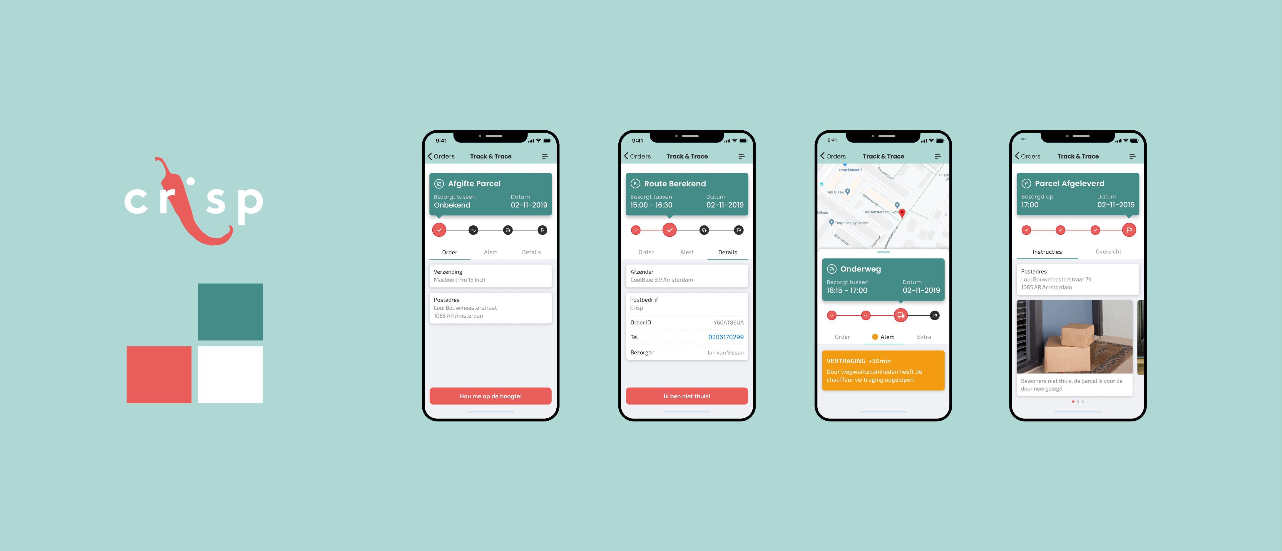
DESIGN
Final Designs
With the final design I tried to stay as close as possible to the branding of Crisp. I incorporated all the colors and fonts provided. I am quite pleased with the end result as its fits all needs.
Creating a web app for mobile that keeps user up to date through the delivery process.
1. Video
For a better idea about the flow and a clearer context I posted a video of a prototype above. There are way more interactions in each screen but this one is simple.
2. Conclusion
This was not a project I started and was involved with till the conclusion I would have liked to test out the final design. However I am pleased with the result.
3. Learned
One of the most interesting things I learned was about extreme cases. For example packages being left in front of doors. That why we decided to put a photo feature in.